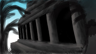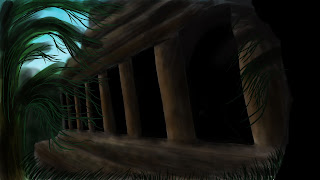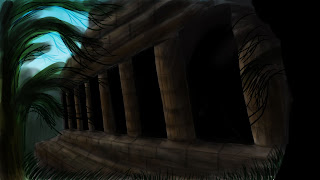


 This is my final progress of my temple image. I really like the way it turned out, as i managed to get the shading and colours to overlay properly. Wasn't too sure about the temple colour at first as it made it look like wood, but by adding brick detail and cracks, it made it look more like stone.
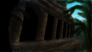
 The bottom image is a flipped version. I can't decide which one i like better, the flipped one just looks different as i was working with it round the other way so i got used to it.
Hi,looking a lot better, however. Take a second look at the perspective of the top of the temple, it appears to be throwing the accuracy out. you should have one vanishing point for all those lines. The top sections dont vanish at the same vanishing point. Give it a try and re post it for all to see, good luck.. Photoshop Phill
ReplyDelete