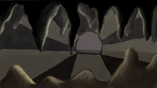
In this image, i added streaks of light. I wanted individual streaks as it would look too much if i made the whole ring of light round the entrance. At first, they were way too bright, so i lowered the opacity to blend more with my foreground.
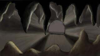
In this image, i blended the edges of the rays of light as i felt they were too sharp and took away from the rest of the image. I also added more highlights to the rocks at the foreground so it would look like the light was hitting them in the right way.
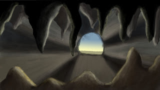
In this image, i added the sky out of the front of the cave using the gradient tool. I had to get it so it matched my rays of light and didnt dominate the scene.
 In this image, i added streaks of light. I wanted individual streaks as it would look too much if i made the whole ring of light round the entrance. At first, they were way too bright, so i lowered the opacity to blend more with my foreground.
 In this image, i blended the edges of the rays of light as i felt they were too sharp and took away from the rest of the image. I also added more highlights to the rocks at the foreground so it would look like the light was hitting them in the right way.
No comments:
Post a Comment