Tuesday, 30 November 2010

The Haunting 1963 review

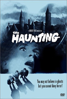
The Haunting 1963 [poster art]

I had never seen this film, directed by Robert Wise, before. It was one of those 'heard of it but never seen it' sort of films for me.
This film builds a lot of suspense quickly when an unknown force starts hammering on the bedroom walls of Elanor and Theo, the camera seeming to focus on the voice and footsteps leading the audience to believe it is really there on the other side. The anticlimax of this persistent hammering, in my opinion, is that it just finishes and the force just seems to walk away. The argument to this could be that it is the house itself that is thumping through the walls, trying to get to Elanor. BBC said 'a genuinely startling film that still retains effective tension.' In this perspective, it really brings the film and also the house to life and makes it that much creepier to think that the house is alive and doing these things to them.
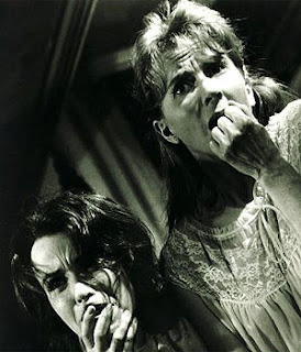
Elanor and Theo [film still]

The fact that you dont actually see anything physical adds to the overall dramatic effect of the film, as it allows the audience to imagine for themselves what the creature could possibly be like. Of the 'ghost', IMDB said 'the film manages to build tension steadily without ever showing the 'ghost,' therefore leaving you on the edge of your seat throughout.' Many of the audience can probably relate to the strange happenings of the house, the bangs and creaks during the night as it cools which after watching this film play at the back of the mind during the night when they're in their own homes. However, NYT had a different view of the film by saying 'this antique chiller drags to an ectoplasmic end, you'll agree that it does have just about everything in the old-fashioned blood-chilling line except a line of reasoning that makes a degree of sense.'
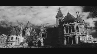

Hill House [film still]

I found this film quite slow to begin with and didnt really engage with it properly until the characters spent the first night in the house. The introduction to the characters was a bit too long and uninteresting in my opinion, but it does mean that it allows the audience to get to know them better and a bit about why they are at the house in the first place.

Quotes:
IMDB The Haunting, 1963. Robert Wise http://www.imdb.com/title/tt0057129/

A final possibility..

I think im leaning towards one of my ideas as it is the one that keeps popping up in my mind and that has the most ideas connected to it.

I'm thinking of doing the hospital scene as i feel i can really create the atmosphere i want in it using elements from my research, and also most importantly create the final scene/image and have it looking good. I can't really explain what the image is in my head so i'll try and draw it and post it on here to see what people think.

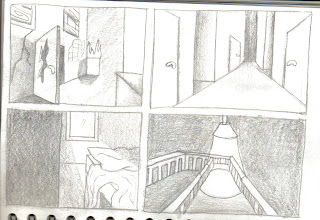
Four quick thumbnails

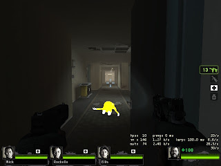
Ok, just knocked out 4 thumbnails while playing left for dead. These four are different in the way that they have different lighting. Top left is lit by a fire which would give a really good glow to the scene. Bottom left is lit by a single ray of light from the window which would create a good mood to the scene. Bottom right is lit by a strong, single overhead light which would cast rich, dark shadows, and top right is general lighting but still containing some shadows for depth along the corridor. Each one is inspired by left for dead.

Atmosphere inspiration: Left for Dead 2 'The Parish'

Another experimentation with image cropping, this time using the window of the door as my cropper. I dont think this is particularly interesting because of the image through the window, but i do like the way it has been framed.
Took this one just before going through a doorway so it was cropped. Main focus seems to be the fire on this one, even though that was unintentional as i was just experimenting with cropping images. Its good as it draws the viewer into the image.
Just a quick shot of the horse statue (Ellis invaded my pic). Like the blurry background and overhanging trees.
This shot is just a quick one i took before i got swamped by rampaging zombies. Use of slight low mist again, and low sunlight coming through the trees.

Went through the 'The Parish' campaign and looked at the scenery and environment in general in the park and took some snapshots of the ones i found most interesting and that i could possibly integrate into my work.

Atmosphere inspiration: Left for Dead 2 'Swamp Fever'

This shot was taken while i walked through the swamp. Again it has the low mist near the ground that i really like, and also the silohuette of the trees. I may use the dark atmosphere in my piece.
This is the same shack, but i managed to take the shot while i shot a zombie and liked the way it lit the room from the fire.
This was taken inside the shack and shows how ruined everything is. I like the rundown and destroyed objects within the room and the way it works really well in the scene.
This shot was taken further into the level, and shows an abandoned shack within the swamp. I like the low mist that covers the distance and the way it is lit by the torch. This is a dark environment which works well for the game, and could intergrate the effect into my work.
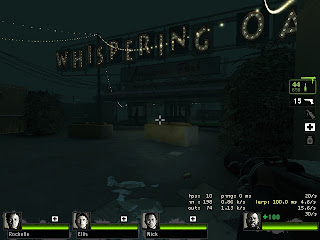
This shot was taken at the beginning of the level. The floodlights created this strong lighting which i quite like. The environment definitely has an abandoned feel about it.

Went through the 'Swamp Fever' campaign and looked at the scenery and environment in general and took some snapshots of the ones i found most interesting and that i could possibly intergrate into my work.

Fairground inspiration: Left for Dead 2 part 2

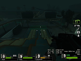
Another image i really like. A different angle of the boats, this time above them. I love the solitary light that is lighting the scene on the walkway and boats. Nice deep shadows in this one create an epic spooky feel.
Ok, really like this one of the swan boats. Love the way the lighting is working coming from that one light in the corner above them as it give some awesome shadows. The whole image to me, makes the boats feel isolated, unwanted and almost alien. Good shadows as well in this one.
A shot of pretty lights in the tunnel of love. Not much lighting in this one, not too keen on it really.
Moving through the tunnel of love, i took this shot of the heart-shaped arches. I particularly liked the way they framed the shot and created 'layers' within the image.
This is a shot going down the stairs into the tunnel of love level. I again really liked the lighting down the stairs and the way the shadows framed the picture.
This is a shot looking out from the safe room. I liked the way the stairs were lit just by the purple lights going up.

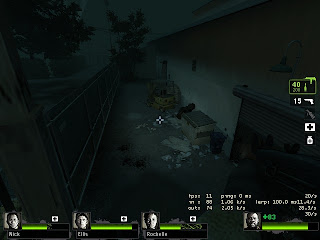
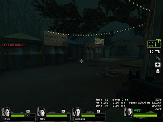
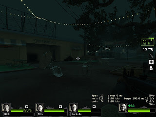
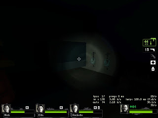
I managed to get some shots of the fairground in Left for Dead 2 (between fighting hundreds of zombies). It provides a really 'dead' atmosphere thats dynamic and includes great shadows and lighting that i really like and could use in my work.

Fairground inspiration: Left for Dead 2 part 1

Couldn't resist this one, a shot down the awesome bumpy slide.
This is closer to the sort of shot i wanted, with the ride blocking out part of the scene. I like the way in some parts you can see through sections of the ride to what is going on behind. I did want to find rides with the lights left on but there wasn't any.
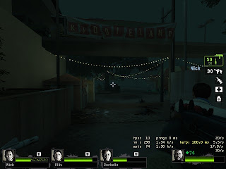
This is a shot of the entrance to Kiddieland (for Ellis :D) Again, good shadows and ominous lighting, although perhaps the shot is a bit wide as there is little obstruction and cropping
This is a shot down one of the alleyways of the fairground. I lit it with my torch to highlight the mess created as well as the blood on the floor.
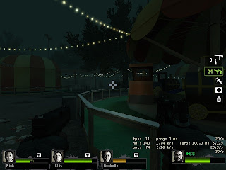
This is another dark shot of the fairground. I like how it is lit by small shades of moonlight and bulbs hanging from the trees. I also like the way the shadows and darkness give the image depth.
This is a shot of the abandoned picnic area of the fairground. I like the atmosphere it creates and the dark lighting. Forgot i had my flashlight off, but there was a witch about so i had to.
Not exactly sure why i took this shot, but it does provide a good single source of light, that being my torch. It also in a way, isolates the urinals by using the spotlight, which could be a form of cropping the image.

I managed to get some shots of the fairground in Left for Dead 2 (between fighting hundreds of zombies). It provides a really 'dead' atmosphere thats dynamic and includes great shadows and lighting that i really like and could use in my work.

One more i forgot..

I forgot to mention one more idea

Fairground
*Carousel
*ferris wheel
*dark shadows
*light from rides?
*light from moon?
*rides blocking part of the shot
*closeup shots
*long shots down between rides?

Hospital inspiration: Left for Dead

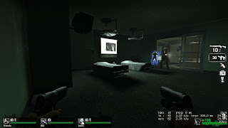
This is a shot of an x-ray room in the hotel level. I wanted a wide shot of it so i could get all of the equipment in and see the whole atmosphere of the scene. I really like the solo lighting over the beds and coming from the screen.
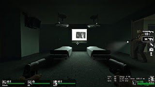
This is a front shot of the beds in the x-ray room (yes, that is Francis in the shot giving me a weird look) The light from the screen showing the hand x-rays gives great shadows from the beds, which look like they should have people in them.
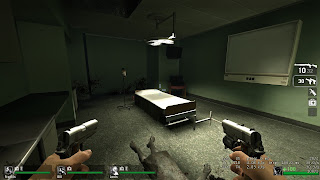
This is a lighter operating room. I took a shot of the bed as it had a bright single light over it and created dark shadow under the bed.
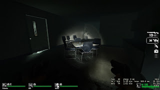
This shot is of a desk lit only by my torch, which gives it great long shadows and a really ominous and foreboding look and feel to it. I also like the light around the edge of the doorframe and through the small window.
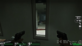
This is a hot through the small window on one of the doors. I wanted this shot as it cropped basically the whole image and focuses right down the corridor. I really like the open door with the blood on the floor and walls, as well as the misty effect as you look down the corridor.
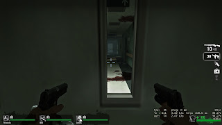
This is another shot from the same door just looking at the other wall, which has large blood splats down it.
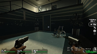
This shot, i wanted a wheelchair thats been abandoned as it sets the mood of the scene. I like the light from upstairs in the corner, but theres a bit too much light in the whole scene for my liking.
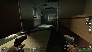
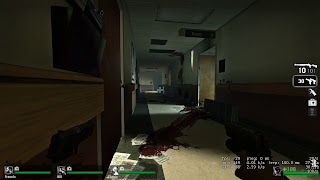
Managing to get away from the zombies i took this shot of a massively blood-stained corridor. Really liking the strong lighting thats coming from the open door and landing on the wall with the picture.
Same corridor, different angle :) Like the long blood streak on the floor, which is similar to what i have in my head as an idea. Deep shadows are also good.
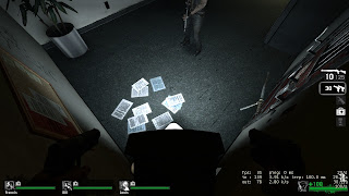
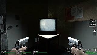
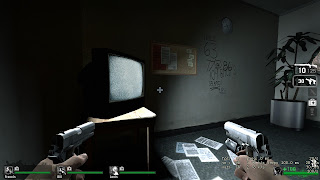
In the safe room standing on the tv so i could get the strong lighting that comes from it (before i shot it)
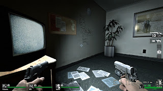
The tv again, but this time getting the light that gives off shadows and lights the opposite wall.
Infront of the tv. I like the two panels of light either side of it and the dark shadow behind.

These are images that i have taken from Left for Dead 2 of the hospital level. This level had awesome atmosphere and lighting, and closely relates to what i want and see in my head.

Hotel inspiration: Left for Dead 2

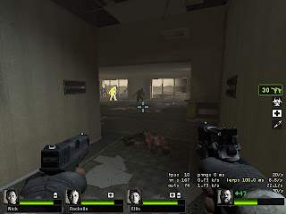
This one has a wider view than i originally wanted, but i like the corner of the wall in the left and the large windows that would be good for light.
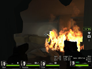
I shot a hole in the door to get this shot (ignore random burning zombie) The way the room is messed up and things strewn on the floor really caught me.
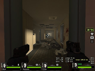
This is a shot of the long corridor of the hotel. I like the length of it and the blood splattered across the walls, as well as the potential for some good lighting from the windows.
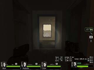
This one is a shot looking through the doorframe to the window. I particularly like this one as it double frames the window and seems to give the shot more depth?
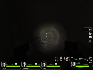
This is a shot of one of the bathrooms lit only by my torch light. I really like the darkness of this shot and the solo source of light as it creates the atmosphere i want. Also, there is blood.
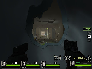
I blasted another hole in the door to get this shot. I like the way i managed to get the corridor framed by the edges of the hole.

These are some images that i have screenshot from the game Left for Dead 2 of one of the levels where you have to go through a hotel to escape. I like the way it looks in this game with all the wreckage caused by the zombies and the general ruin of the building, and it relates to how i want my images to look.


Ideas for project

For this project, a load of ideas sprang to mind in the lecture, even though at first i had no idea what Phil was on about (sorry phil :P) once we watched The Haunting, i tuned back in to my film studies learning from sixth form and ideas formed in my head, some of which might seem a bit wild and impractical but all the same, its ideas that count so far.

Ok, here goes:

1. Hotel
*long corridor
*lights from windows?
*single light from overhead?
*one hotel room with single light from window/overhead
*bathroom with clothes strewn over floor
*view through keyhole into room?

2. Hospital
*long corridor
*lights from overhead/windows?
*x-ray room
*emergency room
*operating table
*look through small window in doors
*blood?
*single strong light source
*lone wheelchair
*quarantine?
*dead flowers in vase as main focus?

3. Playground
*swings
*roundabout
*climbing frame
*slide
*open handbag left on roundabout?
*strong light source from sunset looking through/past swing?
slide partially blocking view?

4. Church
*Alter
*seats
*organ
*looking down the aisle
*light from stained glass windows?
*looking up at Cross
*organ partially blocking view?
*wedding dress strewn on floor down aisle?

5. Staircase
*looking up staircase (makes them look forboding)
*looking down stairs
*looking up past banister
*hanging body?
*single light from overhead?
*single light from window?

6. Graveyard
*Gravestones
*Church
*Trees
*Flowers dying on graves
*Light from church?
*Light from moon?
*look through gravestones

these are my immediate ideas that sprang to mind. My favourite ones are the hotel and the hospital as i think i can do lots with them. I really want to go for a more gothic theme with this, make it quite dark and sinister and also relating to The Haunting as i liked the way it was made to look. I can also probably get good photos of hospitals and hotels if i ask nicely :)

Monday, 29 November 2010

Maya final town house

This is my final render of my town house. I found the videos easy to follow but did have some mix up of the layers in photoshop but i managed to sort them out pretty easily. I chose this angle as it looked most interesting and also went for longer shadows so they looked more dynamic.

Thursday, 25 November 2010

Final influence map

This is my final influence map to sum up all of my concept art scenes. I included influence for each scene such as the temple, cave and ruined city and also a couple of artist influence images that i liked the style of and the way they were done, even though there was no way i could get my images to look like that.

Essay research- Snow White

I looked at the film 'Snow White and the Seven Dwarves'. This i chose at it was Disney's first ever full length animated feature so would provide me with interesting facts and details about how they came to produce this classic.

I looked at the film itself and using past film studies experience, critically analysed scenes, character designs, set deigns and editing. I also took out the book 'Snow White and the Seven Dwarves- The Art in the Making' from the library to better understand how the designers and producers got their inspiration for this film and how they came to make it.

I looked at the character design of Snow White, the Dwarves and animals and how the animators and designers at Disney came to create them as they did.


Another book i also used was called 'Animation Art' and included some good details about the film and also about its success which is another factor that i chose to investigate.